Military cutbacks

Posted by davo | 17:42 | , | 0 comments »


Just found this pic somewhere on the web. Pretty funny! This is obviously the 'solution' they've come up with to the weapons shortage in Iraq and Afghanistan.

Eventually got round to writing up the last bit of this top 10 website design fail list. Again, not in any particular order, each site has it's own relative crappyness. If you haven't already, check out the the first part of my top 10 website fails list.

The first site on part 1 was a danger to epileptics, and, continuing the trend, this one's left sidebar would send you into epilepsy mode. Did 'Franz' (don't know who he is, but you sure won't miss his name plastered all over this page), really need to make the home icon flash like a strobe light? Not a very good design tactic if half your visitors end up in hospital, but then, the site doesn't seem to be the most useful.


This Norwegian site takes years to load thanks to the images and how they've been resized. They're trying to sell all this crazy stuff, but seriously, would you buy anything from a website that couldn't even order the sections on it's homepage properly?

Next is Yvette's bridal services. Picture this, you're a woman looking forward to the big day, finally getting married. Who do you choose to organise the dress? The person who can't even order their website? The dress would probably end up with the arms in the wrong place or whatever like that. Also, it says some plugins are missing. I guess I'm missing the 'make terrible websites readable' plugin.

Winner of the 'most HTML tables on one page' award. It gets worse further down the page:

This final site, really doesn't paint a good impression of the Martinsburg police. If they're as good at policing as they are bad at web design though, then they should be pretty damn good. Also, check out the option to be notified by 'email, cell, pager' of emergencies. OK, I understand cell phone and pager, but who, I mean WHO, would sit at their computer constantly checking their inbox about whether there's a burglary or something happening down the street??

And that's it for this website design fails review. Check back soon for more crazy fails. You don't know what you'll find (though most likely computer and fail related).

Here's basically a list of some of the worst websites I've found while on the web, in no particular order. Seriously, what were these people thinking making sites looking like this?

Not sure what this site is about, although it has a lot of burly, black men on it. Seriously though, epileptics BEWARE. This site makes you feel like you've just taken a load of some crazy drug and are on some insane trip. The after-images of those brightly coloured polygons are still burned into my retinas.


This next site might require you to take motion sickness pills before you look at it. A rainbow background may seem like a pretty idea, but in reality, you're just going to make your readers vomit over their computers, something that funnily enough, is not what most web designers aim to do. Is this what Jesus would do?


Why agonize over going for a one, two or three column layout, when you can have 7?! It's made even easier by having something like 6 or 7 navigation bars.


Seriously, have these people even looked at their site? How can you manage to have so much stuff overlapping and mixing together? It looks like something that a four year old would make.


Apparently (after I had to highlight the text to read it) this site is 'always under construction'. Well then, at least enable me to read that it is under construction. Why is that face in the background smiling? It should be crying if it's on that god awful site.


And that's it for part 1 of my 'how not to design a website', ladies and gents. Check back soon for part 2!
EDIT: Here's part 2 of my top 10 website design fails.

Ok, for my first post I thought I'd show you these general Internet failures.
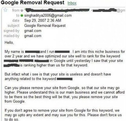
First off, we've got this SEO blackmail letter (don't what SEO is, you're an idiot. Nah, just check out this SEO article). The guy who wrote this would be literally the world's worst gangster; "Excuse me, please shut down your shop. 'Cos we want more customers. Thanks". Not hugely convincing. Apart from the line where he threatens to sue the website owner if they don't remove their site from Google's listings. Funnily enough, you can't blackmail people to take their site off Google. Strange that.


Next up, there's Google's fail (now if you don't know what Google is... just get out!). So much for Google being a "wholly impartial search engine". Not so impartial when your own suggestion tool lists a load of racist phrases.


And finally there's another Google fail; them flagging their own site, Google Maps as malware. You'd think, as the 'net's biggest search engine, they could at least know that their own sites are safe to view. Unless, on that day, some hacker replaced Maps with some hideous porn site with a load of viruses. That'd be the day...

This blog...

Posted by davo | 19:44 | , | 0 comments »

Congratulations on being one of the first victi--- I mean visitors to my blog. Here you'll find a load of funny stuff (well, it was either funny at the time, or I thought it was funny) including internet fails, computing fails and general failing. There'll be some other random stuff that I find on my travels about the 'net, so check back often for some craaaazzzyyyy updates. Hope to see ya' around.